Humans are visual. We just are. According to a study by the Social Science Research Network, 65 percent of people are visual learners, and there are numerous marketing studies showing that visual content performs better.
Design – both good and bad – makes a difference in how we perceive and experience the world. The recent rise of visual storytelling has drawn attention to visual design, and most digital platforms put visual content at the forefront, further emphasizing the importance of visual story over verbal messages.
In branding, visual design is what translates brand strategy into compelling communications and creates a strong emotional bond between companies and customers. Design has the power to influence purchases, decisions and actions. What’s more, it reinforces the brand and leads to a stronger brand performance and increased brand equity over time.
Think about how Tiffany’s iconic blue has become a desirable symbol of exclusivity. The positive emotional response evoked by the blue box has a significant brand value. Or think of how the Nike “swoosh” has come to symbolize everything that the brand stands for. Nike not only has redefined its own category, but also the meaning of a brand image.
Visual Identity
Although there’s much more to any brand identity than its visual aspect, visual identity is often the most recognizable expression of a company’s brand.
Defined by the brand personality, a brand’s visual ecosystem includes its logo, color palettes, graphic and typographic elements, imagery and more that all come together to form a rich visual vocabulary unique to the brand.
Target’s visual branding is an example of using visual brand assets to create campaigns that are unique yet immediately recognizable and always 100% on brand.
How do brands like Target have such diverse brand expressions but still make them so on-brand? They lead with a brand strategy and design their brands for flexibility.
Begin with a Strategic Foundation
Today’s always shifting environments, platforms and customer expectations have created the need for brands to react and pivot fast, to evolve and be agile, while building and maintaining brand visibility and differentiation.
For a brand to flex and for design to reach its full power and potential, the brand must stem from a strategic foundation (brand platform).
Having a strong core is what enables brands to be fluid, adaptive and always evolving while staying true to their underlying principles, purpose and character. A brand that knows what it stands for can easily adapt to the environment, audiences and context and act appropriate in any given situation – especially critical for brands with diverse audiences or those that have to engage across different geographies and cultures.
From Static to Flexible Visual Systems
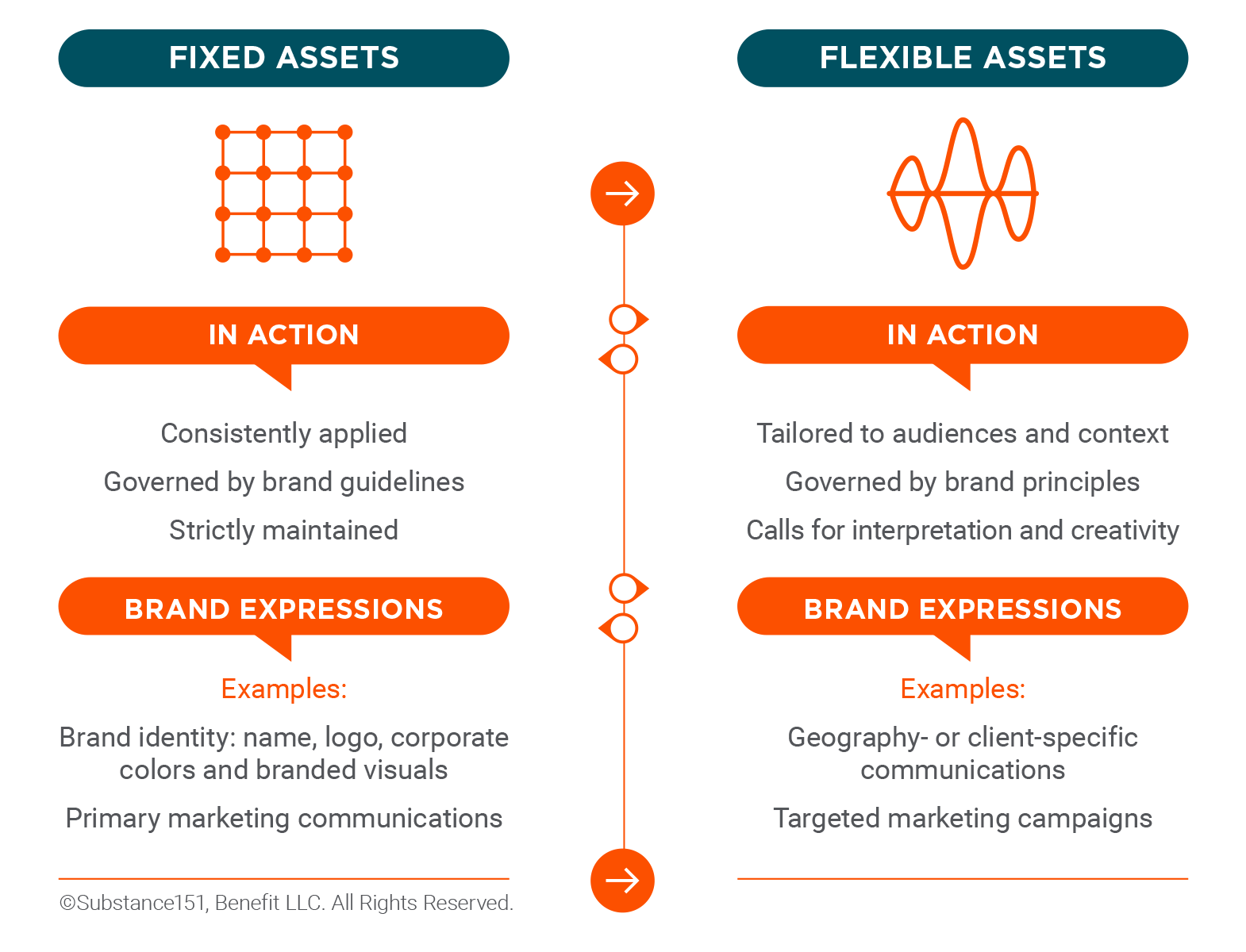
Just like having a strong strategic foundation allows brands to flex, designing for flexibility allows brands to avoid being boring and repetitive across a multitude of channels and applications without losing those qualities that define them.
Think of it this way: instead of repeating the same word over and over again you use a variety of words and phrases to tell your company’s story. You wouldn’t use the same word again and again in a single sentence, right? Visual repetition creates the same effect – it indicates poor vocabulary.
Flexibility must become central to any design solution, especially when it’s the most widely used element of your company’s visual identity.
However, moving away from the approach where meticulously detailed guidelines strictly police the brand and toward creating an extended, rich and diversified brand language requires a visual strategy beyond vertical and horizontal logo versions.
Related content: A Brand Management Master Class
How Flexible?
If flexible visual identity is a better approach, why wouldn’t you go flexible all the way?
First, not all brand assets are created equal. Every brand has iconic elements that define it and make it immediately recognizable – think Coca-Cola’s iconic script or McDonald’s golden arches. Even companies that have to adapt to the global marketplace have untouchable brand assets – whether it’s their logos, colors or other essential design elements.

Answer the following questions to help you decide how flexible your company could and should you be with its brand assets.
How strong is your brand’s level of recognition? Although it could be OK to use your logo’s visual mark without the name as a social media avatar, if you are buying an ad in a conference brochure, the risk of people not recognizing your company without its name (unless you are Nike) is too high.
What is your brand’s level of exposure? For smaller companies with limited marketing exposure, a fixed system provides a higher level of consistency that leads to stronger brand recognition over time.
However, if your audiences regularly interact with your brand, a fluid system can keep communications fresh and contextually relevant with a more extended visual vocabulary and greater design flexibility.
Do you have the resources to maintain a flexible design system? Consider how hard it will be to maintain the integrity of your brand. Fewer brand assets and a limited number of pre-defined design options require less time and resources to execute.
Fluid systems offer more choices but require more hands-on guidance from brand managers or outside design experts – and much more brand training and education, not to mention the higher implementation costs.
What is your team’s branding and design expertise and experience? With a less complex system, most practitioners can manage their brand’s expressions. Fluid systems leave a lot of room for interpretation and require a trained eye and much more in-depth design skills, experience and expertise to allow for case-by-case customization and decisions.
Leveraging the Power of Design
Regardless of where your company is on the scale of static to flexible, there are some fundamentals that all companies must follow when developing or redesigning their visual identity.
Create Brand Alignment
Creating a strong, differentiating brand requires companies to make tough choices – choosing a single brand idea while letting go of other good ideas; taking a stance for something to attract the right people (clients and employees) while possibly alienating others; and streamlining business offerings in order to focus on a few things a company does better than anyone else.
To communicate a brand and all of its defining characteristics and qualities to its intended audiences, companies must make equally bold choices when it comes to visual branding.
There’s a direct correlation between your identified brand personality traits and your design choices.
For example, if you define your brand personality as “edgy,” your visual design must be modern, and you need to refresh it much more often to stay “on-trend.”
If your brand personality is “sophisticated,” your visual identity must be confident, polished and savvy.
Be Memorable
A company’s visual design must be a reflection of its distinct brand. And yet, we see entire industry categories fading into the gray fog of sameness – same color palettes, almost identical web layouts, superficially trendy logos and overused cliché images. Why?
These companies are afraid to break the visual status quo. They are too focused on what the competition is doing and miss the mark on creating differentiation.
Assess your competitive set, but with an eye for an opportunity to create differentiation. Strive to develop a visual identity that uniquely represents your brand, increasing customer recall and affinity and separating your company from the rest.
Focus on Customers
Your brand, while a reflection of your company, must be meaningful and relevant to your audiences. Your visual design is the bridge between the brand strategy and the brand experience and must be focused on engaging, connecting and promoting the desired action.
Good design is not about shares or likes or quick-win metrics. Good design is concerned with generating meaningful brand conversations at every customer touchpoint, thus creating strong emotional resonance and relevance for the customers in the long run.
Related Case Studies
Bohler: Helping an Ambitious Brand Realize Its Purpose
Century Engineering: Helping an Engineering Firm Raise the Bar
The Association of Medical Facility Professionals (AMFP): Visual Branding