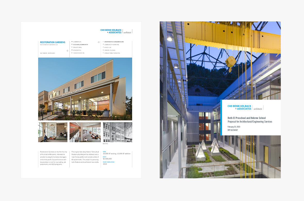
Brand Identity, Brand Guidelines, Proposal System, Electronic Templates
For over 30 years, the firm and its founding principals have built a stellar reputation and regional recognition among their clients, teaming partners and industry. It was critical that the image refresh effort build on that reputation and Cho Benn Holback+Associates’ character.

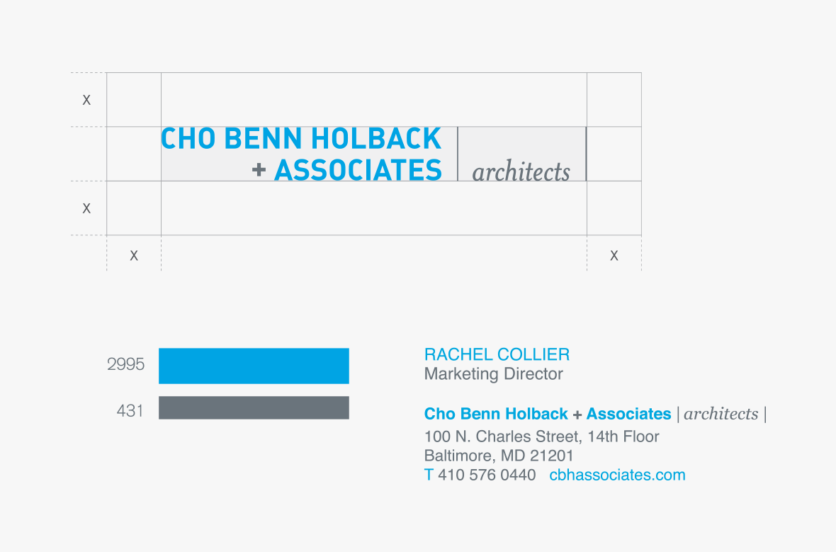
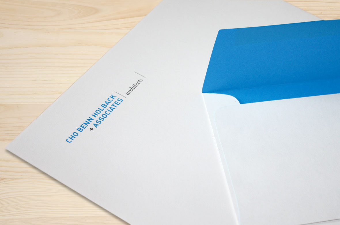
Substance151 developed a number of typographic and color studies to create a logo that speaks to the Cho Benn Holback + Associates sensibilities and is grounded in modern design aesthetic.
The combination of a strong, modern sans serif and a warmer serif type is a direct reflection of the work that the firm does and the image it looks to project. Bright, almost “techy” blue adds to the modern feel and is balanced by the classic, sophisticated gray.


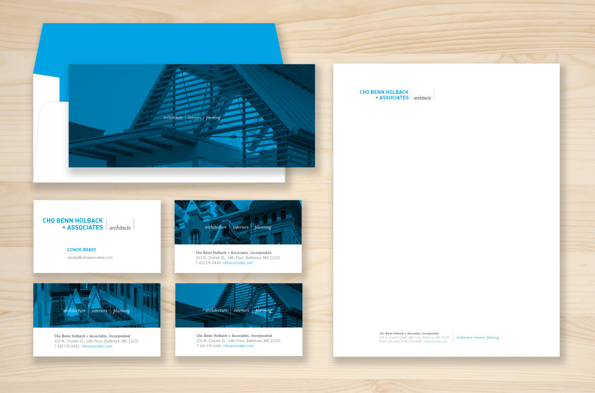
Expanding Cho Benn Holback + Associates’ established visual vocabulary, the photographic images on the backs of the business cards add texture and showcase the broad range of Cho Benn Holback + Associates’ project expertise: from historic preservation to new and modern.

Do you have a branding or marketing project in the works? We’d love the opportunity to share how our approach can help you fast-forwards results. To start a conversation, fill out our project inquiry form, call 410-732-8379 or email.
Project Inquiry