Identity, Visual Language, Web Design
Koolhof Earth needed an identity that is clean, modern, impactful, appealing to broad audiences – from environmental scientists to grant makers, legislators and consumers – and poised to support the organization’s growth.
Working with the overarching concept of “environment,” “community” and “movement,” Substance151 developed an identity that has water-like energy (although Koolhof Earth addresses diverse environmental issues, water is one of its primary focus areas, as well as its geographic tie to the Chesapeake Bay). The concentric, organic circles also represent a growing movement that Koolhof Earth is both a part of and looking to create.


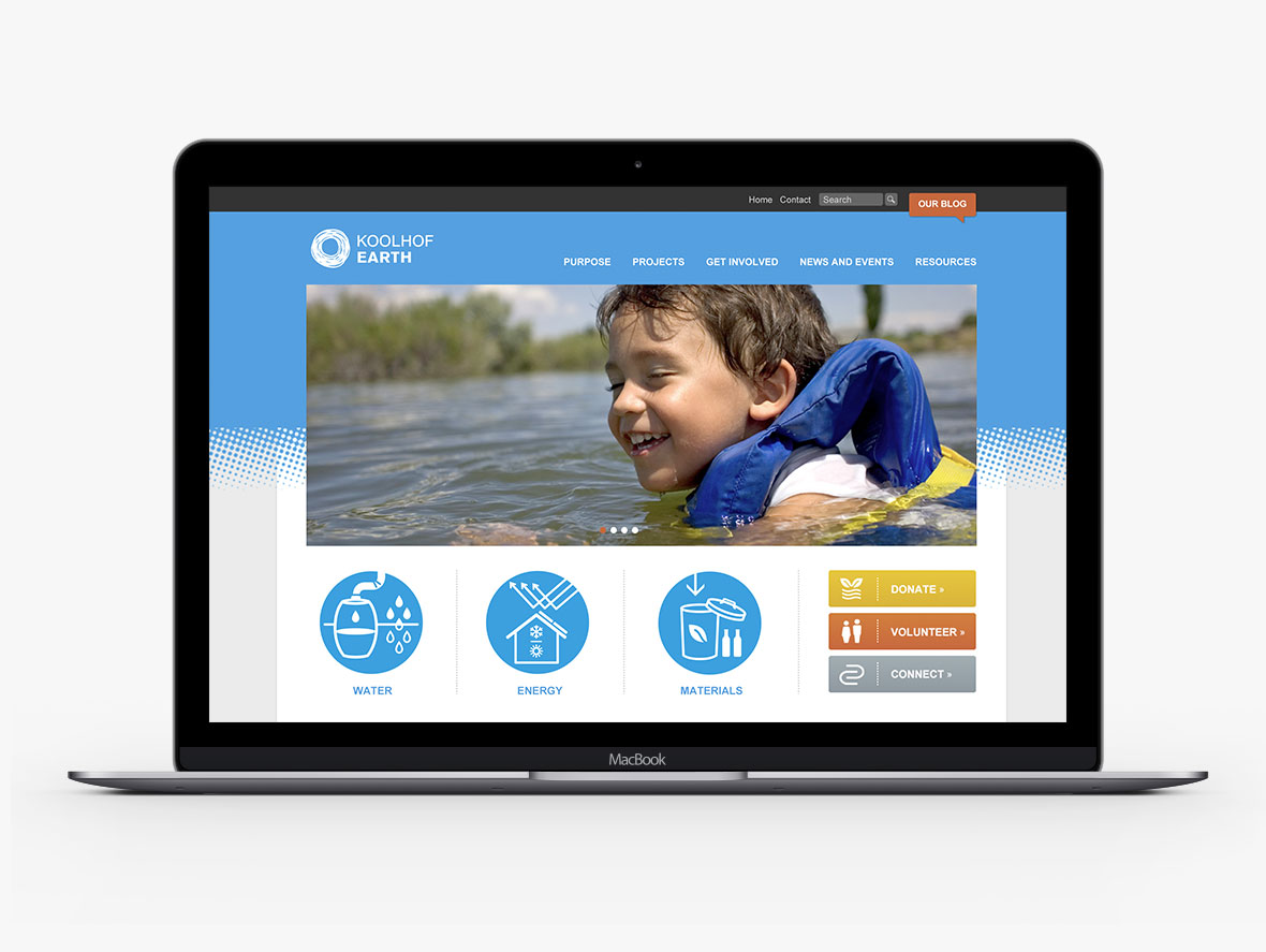
The website was designed to provide the organization with a much needed online presence. Its visual strategy continues to emphasize the organization’s primary focus areas: energy, water and materials. Substance151 created a series of diagrammatic illustrations in order to facilitate a quick, at-a-glance comprehension of key messages and communicate often complex ideas of environmental science in a way that helps target audiences understand how they can be a part of the solution.
Critical to a volunteer-based, growing organization, the website was built on the WordPress content management system to allow maximum flexibility and scalability. The emphasis on projects, events and practical initiatives strengthens the idea that Koolhof Earth is an organization of “doers.”

Do you have a branding or marketing project in the works? We’d love the opportunity to share how our approach can help you fast-forwards results. To start a conversation, fill out our project inquiry form, call 410-732-8379 or email.
Project Inquiry